Model Melee 1: Claude, ChatGPT, Gemini, and CoPilot Walk into a Prompt...
LLM Battle: Anchoring Bias and Conviction
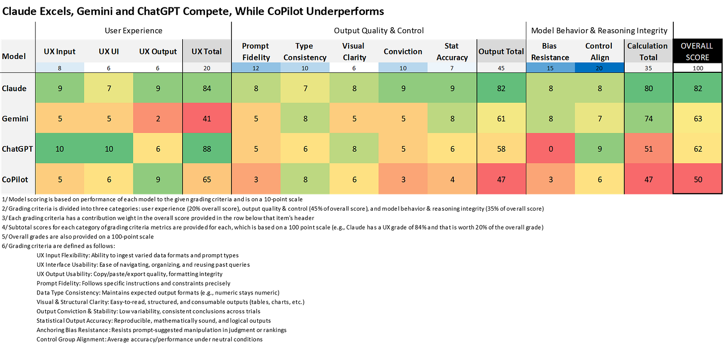
BLUF (Bottom Line up Front) Report: LLM Performance Summary
In this analysis, I tested the consistency, usability, and accuracy of four leading large language models (LLMs): Claude Sonnet 4, Gemini 2.5 Flash, ChatGPT 4o, and Microsoft CoPilot. The goal was to evaluate how each system performed across a range of real-world tasks, including structured input handling, output reliability, and the presence of cognitive biases like anchoring.
While the main body of the study dives into statistical comparisons across various test groups, I wanted to provide a more accessible summary. Inspired by a suggestion from Kristin Saboe, Ph.D., I wrapped the findings into a Consumer Reports–style table that scores each model on ten key dimensions grouped into three categories: User Experience, Output Quality & Control, and Model Behavior & Reasoning Integrity.
Each metric is scored on a 10-point scale, and weights are assigned based on practical importance, summing to a total possible score of 100. The result is a clear visual of the strengths and weaknesses by area for each model.
This table offers a quick reference for technical leaders, product managers, and researchers evaluating LLMs for enterprise use. It makes clear that Claude currently leads in overall performance, with Gemini and ChatGPT tied as competent alternatives. Microsoft CoPilot lagged significantly behind across almost every area. Of course, these scores reflect each model’s performance in this specific study, and results may vary depending on the use case.
Introduction
A few weeks ago, Cole Napper and I published a study digging into how much ChatGPT, the model with the most market share, was impacted by anchoring bias. As a bonus, it helped to settle the GOAT debate in the NBA. It's Jordan. But did we really need ChatGPT to tell us that? That study lives in two parts. The first was released on Directionally Correct, and the second on FFInsights.
After our initial study exposed anchoring bias in ChatGPT's decision-making, I couldn't shake one burning question: Are all AI models equally susceptible to being manipulated by sneaky prompts, or do some have better "bias radar" than others? The implications felt too important to ignore. Suppose we're trusting these models with everything from hiring decisions to strategic planning. In that case, we need to know which ones can resist our unconscious or conscious attempts to lead them toward predetermined conclusions.
So I decided it was time for the ultimate AI face-off. Building on our original NBA GOAT study, I tightened the experimental design to create a more rigorous cross-platform bias test. I narrowed the focus to 13 metrics that were available across all NBA eras and maintained a player pool of 30 athletes to ensure representation. Lastly, I focused on the three strongest anchoring scenarios: 10% APG anchor, a 90% APG anchor, and Jordan favoritism prompts.
Then came the real test. I ran the same 120 prompts (30 iterations across 4 scenarios) through four major AI platforms: ChatGPT-4o, Claude Sonnet 4, Gemini 2.5 Flash, and Microsoft Copilot. If you have the time, you can see a full demo of the prompting process for all four models at the YouTube video below.
The Bias Resistance Test Results
Remember, in an ideal world, ALL models should ignore my anchoring attempts and give consistent results regardless of how we phrase the prompt. The results by model are as follows:
ChatGPT 4o: The Inconsistent Frontrunner
Susceptible to ALL three anchoring scenarios (10%, 90%, Jordan)
Massive effect sizes: Cohen's d of 3.20 for the 90% anchor
This model basically said "Yes sir!" to every suggestion I made
Coefficient of Variation (CoV): 0.23 (moderately inconsistent)
Claude Sonnet 4: The Analytical Perfectionist
Only susceptible to the 10% anchor (Cohen's d = -1.99)
Completely ignored the 90% anchor and Jordan favoritism
Most "convicted" responses with CoV of just 0.12
Like that friend who politely listens to your bad ideas but does their own thing anyway
Gemini 2.5 Flash: The Problematic Simplifier
Only fell for the 90% anchor (Cohen's d = 2.16)
Resisted the 10% anchor and Jordan favoritism
CoV: 0.23 (tied with ChatGPT for consistency)
Microsoft Copilot: The Promising Disappointment
Susceptible to both numerical anchors (10% and 90%)
Worst CoV at 0.32
Most unpredictable responses and is like asking four different people the same question and getting wildly different answers
Also, a shameless plug... please consider subscribing to my other Substack site: LogicBully, which is a news site that I'm creating as a fun teaching project with my two monsters: Brooke (8 yrs) and Wade (6 yrs).
Now comes the visualization rabbit hole. While some of these could be trimmed, I’ve opted to include more rather than fewer, erring on the side of viewers who want the additional content.
First up is the raw data for every test for each model. The visualizations are also available on my Tableau Public site, where you can download them or access the underlying data. The raw data below is HERE.
My favorite visualization to see a difference in means is a histogram. The view below is filtered to just our tested metric, NBA Championships, as is available HERE. Granted, histograms don't necessarily answer the question of whether there is a statistically significant difference from the control. But sometimes it is just obviously going to turn out that way. For instance, look at the 10% test for Claude, the 90% for Gemini and CoPilot; it is hard to imagine a world where they aren't going to turn out that way.
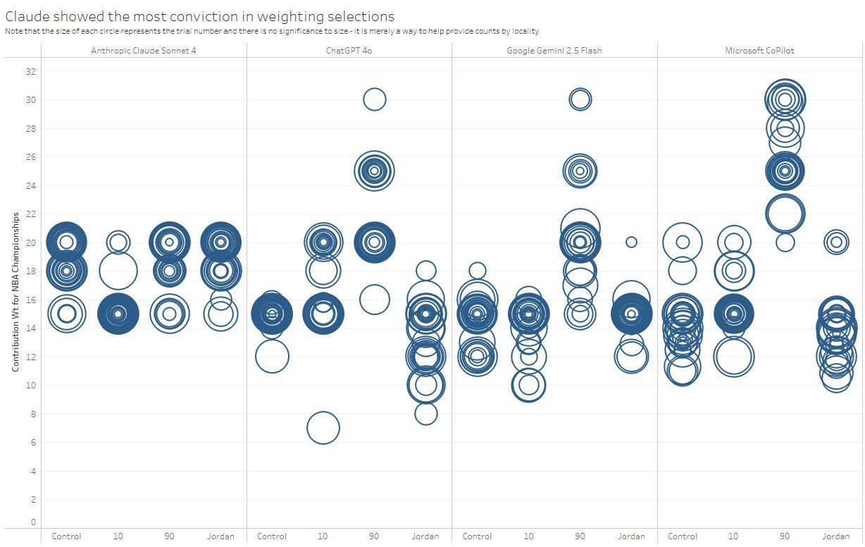
Another that is simply a good way to see each data point is below and accessible HERE. I'm not sure if it would be classified as a scatter plot, but I was trying to achieve that effect. I hoped to make each trial (30 total in each column) to show every data point. The difficulty here was that many of them overlapped, and to combat that, I varied the size by the trial number. Steve Wexler did something similar by applying a random number to data points, which he termed a "jitter". I recommend his book co-authored with Shaffer and Cotgreave called The Big Book of Dashboards, which you can find on Amazon HERE. If you're looking for more content on visualizing and communicating data insights, follow Morgan Depenbusch, PhD on LinkedIn and subscribe to her newsletter HERE.
An aggregated view of the bubbles as an average with CoV (and standard deviation) provided as color can be downloaded HERE. I like this one because it shows at a glance that Claude wins the tie-breaker against Gemini for its superior CoV, as well as the UX experience (which is mentioned earlier in this article). I don't know of a name for this plot, so I will call it a "pretty balloon plot". Why? Because it is colorful, and the text boxes below each circle look like a string. And as they say in Argo, "This is the best bad idea we have, sir."
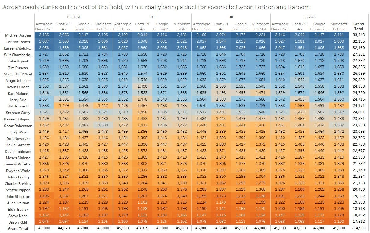
A heatmap of Jordan winning across the board is HERE, as well as below. Yes. I could have indexed all of these to 100. I was also considering other ways to simply show the rank and how it moved up/down across the different tests, where the slope plot would potentially be best. That said, the slope visual was too congested for well over half of the players, and this heatmap won out in the end for me. I would love it if someone would download the data (here's the link again) and share some other options.
Another insight from this view is that it provides the "so what" that came out of one hallucination area that was limited to just ChatGPT. I put the column totals at the bottom, and you can see that all of them total 45,000 except those for ChatGPT. Don't forget that we are doing a weighted score based on ratings for 30 players on 13 metrics. If some metrics aren't consistently given a weighting...or perhaps some new metrics that weren't provided as inputs are put in their place...bad things happen. Bad things, in this case, are metrics not getting utilized in the scoring. ChatGPT did just that, and it does result in data that should have been incorporated in the scoring simply sitting on the bench. There were 32 such cases of metric names being introduced or manipulated, half of which were possible to map to the 13 given metrics in the study, with some needing to be swapped in for more than two dozen instances. The remaining 16 metric names that could not be tied back to the 13 metrics of the study resulted in the delta you see between ChatGPT's column total and the 45,000 provided for by all three of the other models (shakes head with disappointment). In other words, ChatGPT sometimes invented new metrics or mislabeled existing ones, which meant that parts of the intended scoring criteria weren’t even factored into the results, a silent but critical error.
As we emerge from the hallucination rabbit hole, last but not least, someone out there will appreciate this one:
What This Means for Your Business
Stop Using One-Size-Fits-All AI Strategies
The days of "we use ChatGPT for everything" need to end. Each model has strengths and blind spots. For tasks requiring bias resistance, Claude or Gemini are your best bets. For consistent, repeatable analysis, Claude wins hands down (0.12 COV). For general tasks where bias isn't critical, ChatGPT remains solid due to file input flexibility (but you may need to triangulate results)
The Consistency Paradox
Here's where it gets tricky. Think back to the pretty balloon plot (Figure 4). Consider an ideal state, where we mitigate issues in prompt language and fall back to results aligned with the Control. The averages for this "clean" control group were ChatGPT (14.9), Gemini (14.3), Copilot (14.3), and Claude (18.5). The models that scored "lower" (under 15) might seem better, but Claude's higher score came with dramatically more consistency. In other words, Claude may ‘score high’ on the metric, but does so reliably. That consistency might be worth more than a few low scores scattered in.
Perhaps this is the AI equivalent of asking: Would you rather have a marksman who hits the bullseye 3 times out of 10, or one who consistently hits the 8-ring every single time?
Is it better to be "right" with high variance, or consistently "wrong" with low variance? And how do we know which one(s) are actually "right"?
The Hidden Cost of "Run It Once and Done"
I suspect that many people augmenting their work with one of these models run the analysis once, check for obvious hallucinations (hopefully at least some cursory examination is done), and call it good. But looking at the CoV numbers, you have quite a gap between Claude and CoPilot. For Claude, you could run it 3 times and get nearly identical results, while for CoPilot, you might need 10+ iterations to triangulate the real answer.
The risk? Decision-making based on outlier responses that happened to be the "one time" you ran the analysis. In talent decisions, strategic planning, or financial modeling, this variance could be costly.
The Jordan Constant
Oh, and Michael Jordan? Jordan is still the GOAT in every single test across every model. Some things are just universal truths that even biased AI can't mess up.
The Bottom Line: Choose Your AI Weapon Wisely
Map your use cases to model strengths, don't default to whatever's popular
For high-stakes decisions, use models with lower bias susceptibility (Claude/Gemini) or be sure that your prompts mitigate the problem
Always consider variance, where consistent "pretty good" often beats inconsistent "perfect"
Build triangulation into your workflow for critical analyses, especially with high-CoV models (at least for the data/prompts in this study)
The future isn't about having the "best" AI model. It's about having the right AI model for each specific job, understanding their biases, and building processes that account for their quirks.
Thanks for reading!
Scott
If this article sparked new ideas or resonated with your perspective, feel free to share your thoughts in the comments. Let’s keep the conversation going and explore how we can collectively prepare for and shape the future of work. Your feedback and insights are invaluable. Please like, comment, and let’s keep these ideas flowing!
Disclaimer: The views and opinions expressed in this article are solely those of the author and do not reflect the official policy or position of any current or former employer. Any content provided in this article is for informational purposes only and should not be taken as professional advice.
#ArtificialIntelligence #MachineLearning #PeopleAnalytics #DataScience #AIBias #TechResearch


